
If you've ever fallen in love with a paint color on a chip at the hardware store, brought it home, rolled it on your wall, and thought that is absolutely not what I picked — you are not alone. Color selection is one of the most common frustrations homeowners face, and here in Michigan, there's a specific reason it catches so many people off guard: our natural light is unlike anywhere else in the country.
From the long, golden summer days near the Great Lakes to the flat, gray winter light that settles in for months at a time, Michigan's shifting natural light can dramatically change how a paint color looks on your walls. Understanding this relationship between light and color is one of the most powerful tools you can use to create a home that feels exactly the way you want it to feel — no matter what time of year it is.
Why Natural Light Matters More Than You Think
Light is the single biggest factor in how we perceive color. A warm white that looks creamy and inviting on a sunny afternoon might look dingy and yellow under overcast winter skies. A cool gray that feels sophisticated and modern in a north-facing room might appear almost blue in certain lighting conditions. This isn't a flaw in your perception — it's just physics.
Paint pigments reflect light, and the quality, direction, and intensity of the light source changes what those pigments reflect back to your eye. In Michigan, this becomes especially important because we experience such dramatic seasonal shifts in daylight. A color you choose in July is going to behave very differently in November, and a smart paint selection takes both seasons into account.
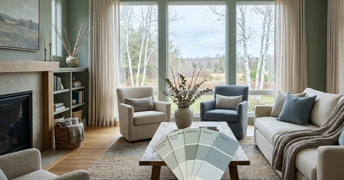
Understanding the Direction Your Windows Face
One of the first things to consider when choosing interior paint colors is which direction your windows face. This determines the quality of light your room receives throughout the day and throughout the seasons.
- North-facing rooms receive indirect, cooler light throughout the day. Colors in these spaces tend to read cooler and darker than they appear on a chip. Warm tones like creamy whites, soft yellows, warm beiges, and earthy neutrals help counteract the cool light and keep these rooms feeling inviting.
- South-facing rooms receive the most consistent and warm natural light. These rooms can handle a wider range of colors, including cooler tones that might feel cold elsewhere. Deep, saturated colors often look spectacular in south-facing spaces.
- East-facing rooms are bathed in warm morning light but can feel cooler in the afternoon. If you use the room primarily in the morning, warm and bright tones will feel energizing. If it's an evening space, consider how it will look in artificial light.
- West-facing rooms catch golden afternoon and evening light. Colors in these rooms can appear very warm and almost glowing later in the day, which creates a cozy atmosphere but can make warm tones feel overpowering. Cooler, balanced neutrals often work beautifully here.
Working With Michigan's Seasonal Light Shifts
This is where Michigan homeowners face a unique challenge. We don't just have one consistent light environment — we have brilliant summers with long days and intense sun, and winters with reduced daylight hours, frequent cloud cover, and that particular quality of flat gray light that our residents know all too well.
A color that looks perfect from May through September might feel oppressive by January. That doesn't mean you can't use darker or more saturated colors — it just means choosing them thoughtfully and understanding how they'll behave year-round.
Strategies for Year-Round Color Success
The good news is that there are reliable strategies for choosing colors that hold up beautifully through every season Michigan throws at us. First, always test your colors on the actual wall rather than relying solely on chips. Paint a large swatch — at least 12 by 12 inches — and observe it at different times of day and in different weather conditions before committing. What you see on a Tuesday afternoon in bright sun should also work on a gray Saturday morning.
Second, consider the undertones in your chosen color carefully. Michigan's winter light tends to amplify cool undertones, so if you're choosing a neutral that has even a slight blue or green undertone, it may read much cooler in winter than you anticipated. Warm undertones — those with hints of red, yellow, or orange — tend to hold their warmth more reliably across different lighting conditions.
Third, think about your artificial lighting as well. Since Michigan winters mean spending more time indoors with the lights on, your paint color needs to work with your light fixtures too. Warm bulbs bring out yellow and red undertones, while cool daylight bulbs can shift colors toward the blue and green end of the spectrum.
Room-by-Room Color Guidance for Michigan Homes
Every room in your home has its own function, its own relationship with natural light, and its own emotional purpose. A great color strategy takes all of these factors into account rather than treating your whole home as a single canvas.
Living Rooms and Main Gathering Spaces
These are the rooms where Michigan families spend the most time, especially during the winter months. Because they need to feel warm and inviting even during the darkest days of December and January, lean toward colors with warm undertones. Soft whites with a hint of cream, warm greige tones, muted terracotta, and earthy sage greens all perform beautifully in Michigan living rooms. They feel current and elegant without relying on the sun to look their best.
Bedrooms
Bedrooms are more personal spaces, and the direction they face matters enormously here. A north-facing bedroom benefits from the warmth of dusty rose, warm taupe, or a soft butter yellow. A south-facing bedroom, on the other hand, can embrace cooler tones like soft blue-gray or muted lavender without feeling cold, because the natural light will warm them up throughout the day.
Kitchens
Michigan kitchens tend to be hardworking family hubs, and the paint color needs to hold up to lots of activity and varied lighting conditions. Crisp whites, warm off-whites, and soft sage tones are perennially popular for a reason — they're versatile, they work with natural and artificial light, and they complement the wide variety of cabinet and countertop finishes common in Michigan homes. If you're considering a bolder color, keep it contained to an accent wall or lower cabinets to test how it lives before going all in.
Let the Professionals Help You Get It Right
At Blackhurst Painting, we don't just apply paint — we help our Michigan clients make confident, informed color decisions before a single brush touches the wall. Our team understands how light behaves in Michigan homes across all four seasons, and we work alongside homeowners to select colors that will look beautiful in February just as much as they do in July.
Whether you're refreshing a single room or repainting your entire home, getting the color right from the start saves time, money, and the frustration of living with a choice that doesn't quite feel like you. We're here to make the whole process enjoyable, from that first color conversation through the final walkthrough. Reach out to Blackhurst Painting today and let's talk about what your space is telling you — and what the right color can say back.
